Posts

Showing posts from 2017

Non Commercial Art

Image
This image from the PDNEDU immediately stole my attention. This image to me, seems so real. There isn't anything indicating that this image was staged. It captures human emotion and the exhaustion of a new parent. Jay Maisel photographed this as part of his idea to capture photographic life. It seems that this was not commissioned but still very well thought out. The use of warm colors here really makes the life stand out and bring you in. Asymmetrical balance draws your eyes to the baby pictured first but only gets more interesting the deeper you look at the photo.

Symbolic Colors

Image
In my opinion, this generic image of the American Flag swaying on this barn symbolized so much more than just 4th of July. The imagery used here portrays the story behind the hard-working American with nothing but patriotism. Symbolically, red-white and blue are being used here to portray 4th of July without writing it out specifically. This image, too, can be located in the Photographer's FORUM from artist Cheyenne L. Rouse.

Color Discord

Image
I found this image to be particularly intriguing in the colors that are pictured here. The teal/orange/navy color scheme is the closest I related to color discord. I think this image still works because although the hues are different with each color, I can still appreciate the art because the saturation and brightness of each other color seems close enough to make the overall unity of this piece work. Taken by Cheyenne L. Rouse, this image can be found in Photographer's FORUM Fall 2013 edition on page 45.

Creativity

Image
I found this image in American Photo on Campus. I found this image of these lucky charms in what appears to be a milk bath with marshmallow flavoring and perhaps some added color. I thought this idea was very creative and thought provoking. I think the colors here are very bold and they bring out such a random balance it seems almost calming.

Color Harmony Rules

Image
I found this image in Graphic Design USA. I can see and appreciate the monochromatic color scheme used, meaning that the same color is used, and the the hue will always remain the same. The blue is so subtle here that I think it really ties everything together well. This advertisement was found also in Graphic Design USA (pg 19). I saw this as a good example for analogous. I see the The violet blue and blue-violet used here to convey the same color family. This ad was found in Graphic Design USA (pg 99). This is an example of complementary colors used to make the font stand out against the background. The scanner did change the image coloring a bit but the background is generally blue whereas the font is an orangey shade of brown. This last image was found in American Photo on Campus (pg 6). This is my example of triadic color schemes used to harmonize the scene. In this photo, I see purple, green and orange along with the blue pants to really compliment these colors.

Color Inspiration

Image
This week's assignment was to find an image that was visually pleasing. This image really caught my eye. The colors captured here compliment and really bring out each other color. The scanned image appears to make it look painted, but in printed in the magazine Popular Photography on Campus, the colors are so vibrant and work very well with one another. You can even see that in the pixelation in the second photo. The architecture here is super interesting because of the angle the photo was shot at. The bottom of these buildings may not have had color, making this so interesting, almost changing the image. This image was taken by an architectural photography, Slobodan Blagojevic. I think he did a really good job capturing the personality of the city and eye-catching angles.

Positive & Negative Space

Image
I was immediately drawn to this image of a shell as we are reflecting on positive and negative space. The light source is hitting this object making the highlights stand out even more, against such a simple dark background. The positive space, the shell is a revolving curvature item that leads your eye around the subject. This works great in addition to the background because the edges that meet the foreground have that same shape that still lead your eye, perhaps even adding to the tension that it forces. This image can be found in Still Life Photography, and was taken by Edward Weston.

Design Principles: Depth

Image
While reading a small book that I had found during open lab, I located this picture of flatirons for a shoe manufacturing company. When I first was glancing at this photo I didn't give much thought about what an excellent example of depth this is. This photo, although such a simple concept, shows more than what we can just see, and in such an eloquent way that I had almost over looked it. I can not only see the closest flatiron, but I can also see rows and rows of them lined up so neatly. It's interesting because when photographing depth, you can see begin to see images further back in the composition becoming smaller and smaller but this photo is so well done that it never looses focus, even five rows behind because a greater depth of field was used. The artist here chose to photograph all of these objects and gave them just as much importance as the one next to it. This shows that other aspects are just as important and forces you to look at the environment as a whole com

Design Principles: Rhythm

Image
I located this photo in my favorite magazine, the Photographer's FORUM, and I immediately located many examples of rhythm. My eyes were first drawn to the numerous vertical, horizontal, and even diagonal lines showing movement. The lines at the head of the roof even guide your eyes either straight up the non-illuminated building behind the subject or to the light post to the immediate right hand side. This photo to me is an excellent example of rhythm once again because of all of the movement in the architectural lines formed from the home and light. Photo taken by: Latent Landscapes.

Design Principles: Balance

Image
This photo is an excellent example of balance to me. The first thing that i notice is the weight of the sides is relatively similar. The red circles in the background are evenly weighted on both sides, with the man being directly in the middle of the image.This artwork is unified in relation to the image as a whole as it gives you a sense of calm when being viewed. In this instance as well, I notice the negative space both created by the background shapes and even the outline of the man. This is unique because that too, is balanced, making this the perfect example. This photo is taken by Judith Golden and was published in her photographical works book, "Cycles, a Decade of Photographs".

Design Principles: Unity by Proximity

Image
This photo displays unity in many ways, beginning with and focusing on, proximity. These electronic machines, used for any number of reasons, are captured very close to one another, meaning that their proximal location is right next to each other. These machines also have the same general shape, unifying them further when they are seen right next to one another such as in this picture. You can also see repetition in the overlapping lines in between each rectangle. This photo is very unified throughout the composition. Your eye is drawn right to the center of these objects and then to one specific side, most likely the right as it has a heavier feel because there is more going on. This photo is taken by Evgenia Arbugaeva, featured in American Photo on Campus, Spring 2015 edition.

Design Principles: Variety

Image
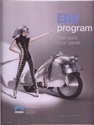
This image that I found is a great example of variety to me. In this picture, I see variety portrayed in many ways, starting with the formation of the text in both uppercase bold, and varietal non-bold text. The color changed with the font as well, giving it more variety to seperate the two lines of text as their own. Variety is also created by changing the way you would view the woman in the photo. The horizontal lines portrayed here on her bodysuit lead your eyes to her motorcycle. This provides you with a variety of things to see, and in many diferent ways and paterns.  This photo works very well with variety because the text is another variety of how you should be feeling when viewing this advertisment. While this image does have the same overall theme, the design makes you look at the images in different ways, using perspective to change the way you would usually see ordinary objects. This photo was found in Photographer's FORUM, taken by Jarmo Pohjaniem/Doug Hill.