Design Principles: Variety
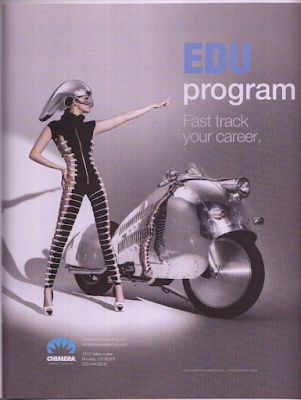
This image that I found is a great example of variety to me. In this picture, I see variety portrayed in many ways, starting with the formation of the text in both uppercase bold, and varietal non-bold text. The color changed with the font as well, giving it more variety to seperate the two lines of text as their own. Variety is also created by changing the way you would view the woman in the photo. The horizontal lines portrayed here on her bodysuit lead your eyes to her motorcycle. This provides you with a variety of things to see, and in many diferent ways and paterns. This photo works very well with variety because the text is another variety of how you should be feeling when viewing this advertisment. While this image does have the same overall theme, the design makes you look at the images in different ways, using perspective to change the way you would usually see ordinary objects. This photo was found in Photographer's FORUM, taken by Jarmo Pohjaniem/Doug Hill.


Comments
Post a Comment