Posts

Showing posts from September, 2017

Design Principles: Balance

Image
This photo is an excellent example of balance to me. The first thing that i notice is the weight of the sides is relatively similar. The red circles in the background are evenly weighted on both sides, with the man being directly in the middle of the image.This artwork is unified in relation to the image as a whole as it gives you a sense of calm when being viewed. In this instance as well, I notice the negative space both created by the background shapes and even the outline of the man. This is unique because that too, is balanced, making this the perfect example. This photo is taken by Judith Golden and was published in her photographical works book, "Cycles, a Decade of Photographs".

Design Principles: Unity by Proximity

Image
This photo displays unity in many ways, beginning with and focusing on, proximity. These electronic machines, used for any number of reasons, are captured very close to one another, meaning that their proximal location is right next to each other. These machines also have the same general shape, unifying them further when they are seen right next to one another such as in this picture. You can also see repetition in the overlapping lines in between each rectangle. This photo is very unified throughout the composition. Your eye is drawn right to the center of these objects and then to one specific side, most likely the right as it has a heavier feel because there is more going on. This photo is taken by Evgenia Arbugaeva, featured in American Photo on Campus, Spring 2015 edition.

Design Principles: Variety

Image
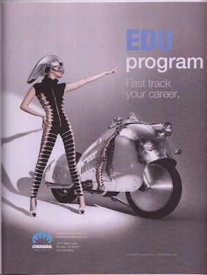
This image that I found is a great example of variety to me. In this picture, I see variety portrayed in many ways, starting with the formation of the text in both uppercase bold, and varietal non-bold text. The color changed with the font as well, giving it more variety to seperate the two lines of text as their own. Variety is also created by changing the way you would view the woman in the photo. The horizontal lines portrayed here on her bodysuit lead your eyes to her motorcycle. This provides you with a variety of things to see, and in many diferent ways and paterns.  This photo works very well with variety because the text is another variety of how you should be feeling when viewing this advertisment. While this image does have the same overall theme, the design makes you look at the images in different ways, using perspective to change the way you would usually see ordinary objects. This photo was found in Photographer's FORUM, taken by Jarmo Pohjaniem/Doug Hill. ...